
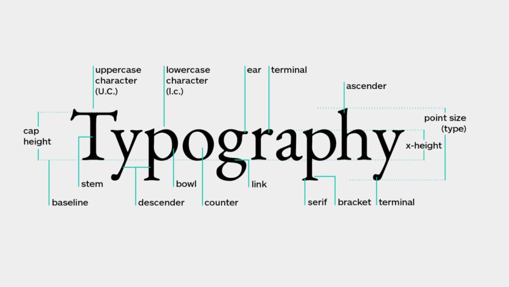
Ever stared at a beautifully designed page and wondered why it just works? The secret sauce lies in understanding the fundamental elements of typography. Let’s dive into what makes type sing on a page.
1. Hierarchy
You know that feeling when your eyes just know where to look first? That’s hierarchy at work. People spent countless hours tweaking font sizes and weights to create that natural flow. The trick is to establish clear levels of importance.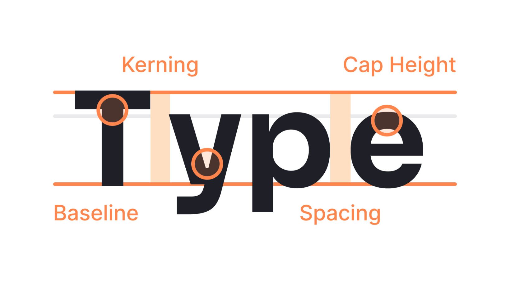
Your main heading should command attention by making it big and bold! Secondary headings can dial it back a bit but still need to stand out from body text. Think of it like conducting an orchestra – some instruments need to be louder than others.
2. White Space
Here’s something most beginners get wrong: they try to cram everything together. But Typography for Effective Typesetting isn’t about using every inch of space. It’s about giving your text room to breathe.
White space (or negative space if you want to sound fancy) isn’t wasted space. It’s like the pauses between sentences in a conversation. Without it everything runs together and nothing stands out. Individuals have found that adding just a bit more spacing between paragraphs than you think you need usually works wonders.
3. Contrast
Want to know what separates amateur work from pro designs? Contrast. It’s not just about black and white either. You can create contrast through:
Size differences matter but don’t go crazy with fifteen different sizes. Similarly, weight variations, style changes, color, etc, can help keep it readable.
The key is intention. Every contrast choice should serve a purpose in your design. Random contrast just creates chaos.
4. Alignment
Nothing screams “amateur hour” like misaligned text. Good Typography for Effective Typesetting demands consistent alignment. But here’s the thing – you don’t always have to default to left-aligned text.
Sometimes centered text works better for headers. Sometimes right-aligned text adds visual interest. The trick is sticking with your choice. Don’t bounce around between different alignments without good reason.
5. Font Selection
Picking fonts is like matchmaking. Some pairs just work beautifully together while others clash horribly. Start with two fonts: one for headlines and one for body text. Make sure they complement each other but don’t look too similar. And please – for the love of design – avoid using more than three fonts in one project.
The Real-World Impact
When you nail these five elements of Typography for Effective Typesetting something magical happens. Your content becomes more than just words on a page. It transforms into an experience that guides readers effortlessly through your message.
I’ve seen decent designs become great ones with just a few typography tweaks. The best part? Once you understand these principles you’ll start spotting them everywhere. (It’s both a blessing and a curse – you’ll never look at poorly designed menus the same way again.)
Remember this isn’t about following rigid rules. It’s about understanding the principles so well that you know when to break them. Because sometimes breaking a typography rule is exactly what your design needs.
Keep experimenting with these elements. Try different combinations. See what works for your specific project. But always keep readability as your North Star. After all what good is beautiful typography if no one can read it?
Take these principles and make them your own. Your readers might not notice good typography consciously but they’ll feel it. And isn’t that what great design is all about?